
Risography
Some guidelines and notes specific to our studio, plus helpful tips + tricks to help you prepare your project for riso printing.Introduction to Riso
-
Risograph printing is a stencil-based printing process that sits somewhere between screen printing and photocopying. Originally designed in the 1980s as a fast, low-cost solution for schools, churches, and offices, the machine functioned as a high-volume duplicator.
Designers and artists became drawn to its bold spot colors, matte finish, and the unpredictable charm created by layering inks one pass at a time. The medium works best for editions between 25-500 copies. -
For each color in a design, the risograph creates a separate “master stencil” by burning a grayscale artwork onto a thin sheet of rice paper. That stencil wraps around a rotating ink drum filled with soy-based ink.
As paper feeds through the machine, ink is pushed through the stencil onto the page, one color at a time. To print multiple colors, the paper is fed through the machine multiple times. We have a 2-color machine, meaning 2 colors can be printed with one single pass through the riso machine. -
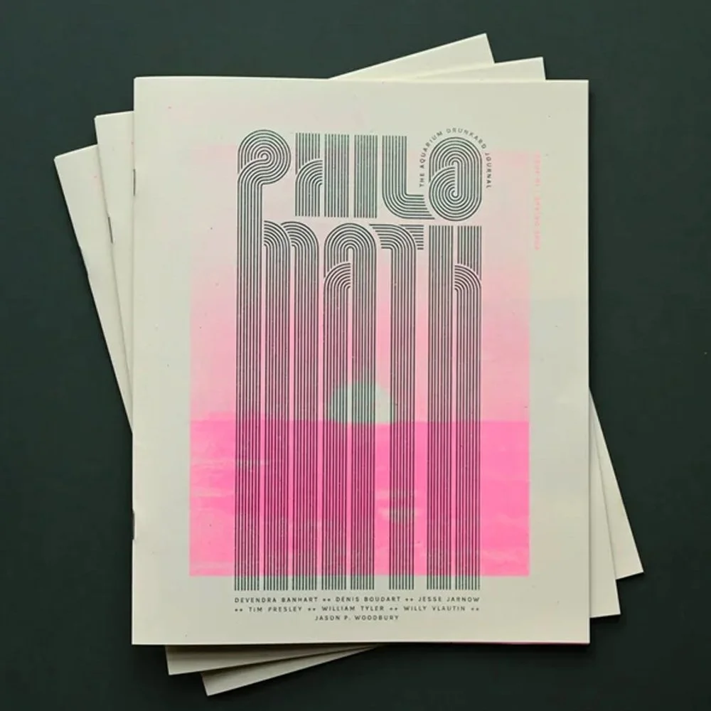
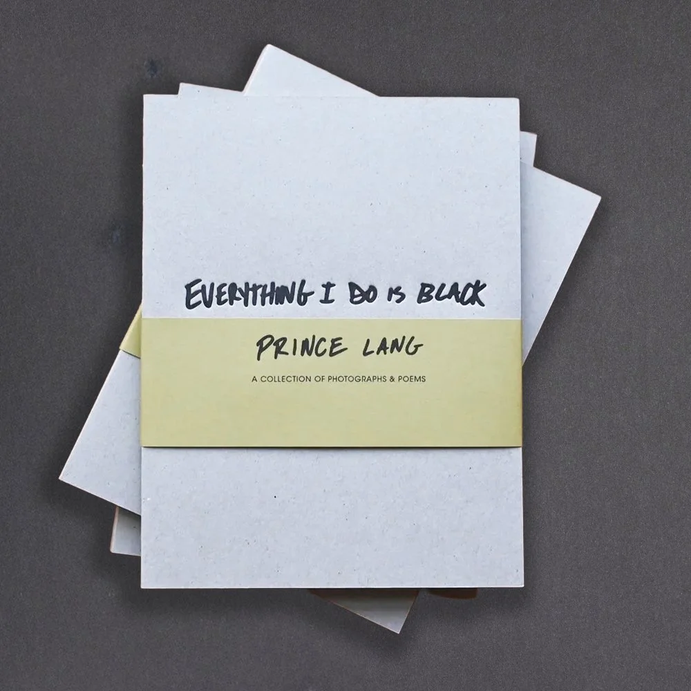
Projects that include a textural, handmade feel, bright pops of color, and bold graphics, text, or illustration are perfect for riso printing. 11”x17” is the largest sheet size we can use, so some common formats include posters, zines, books, cards, mailers, handbills, event programs, schedules, or maps.
Things that don’t work well with riso:you only need one or two copies (great for 25-500 copies)
projects with tiny details that need perfect registration or sharp resolution
projects on glossy paper; we only use uncoated (matte) papers
projects that must be perfect!
-
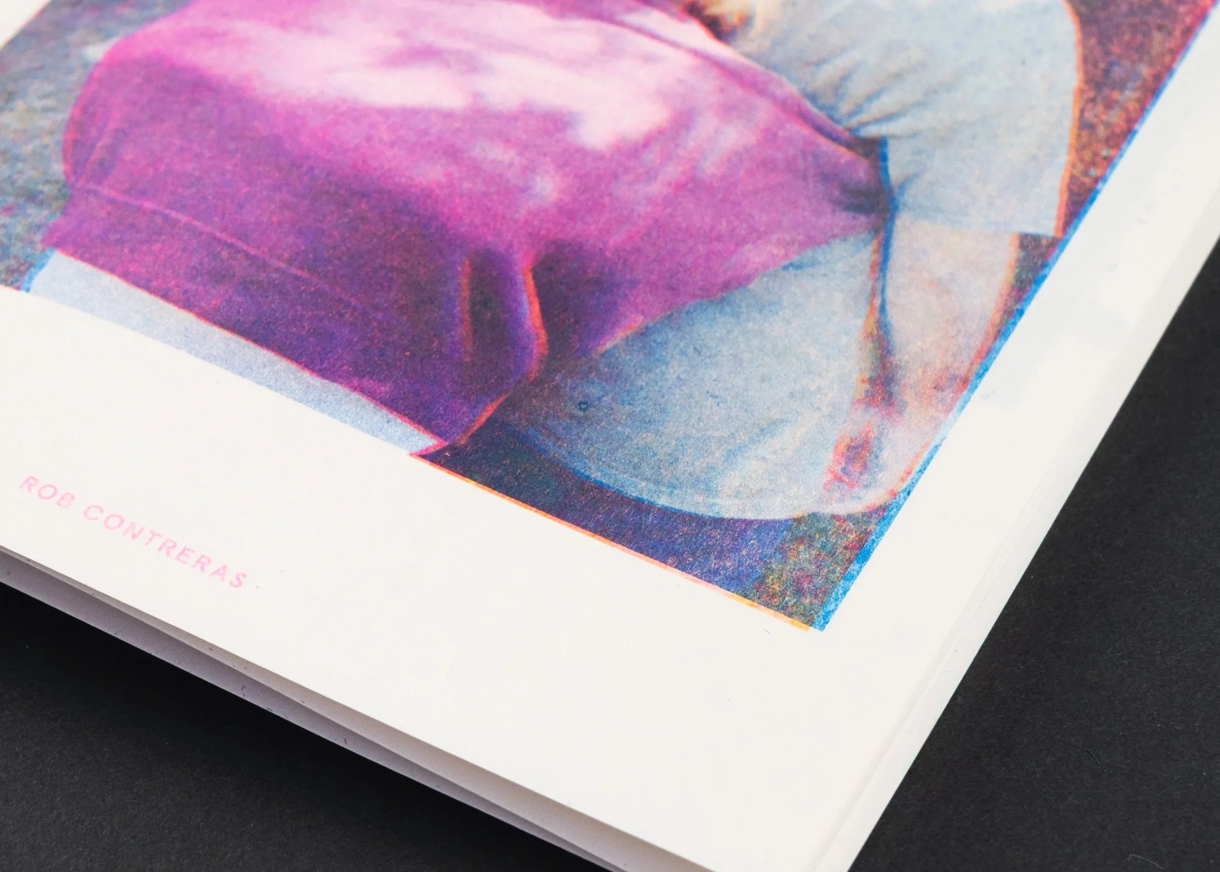
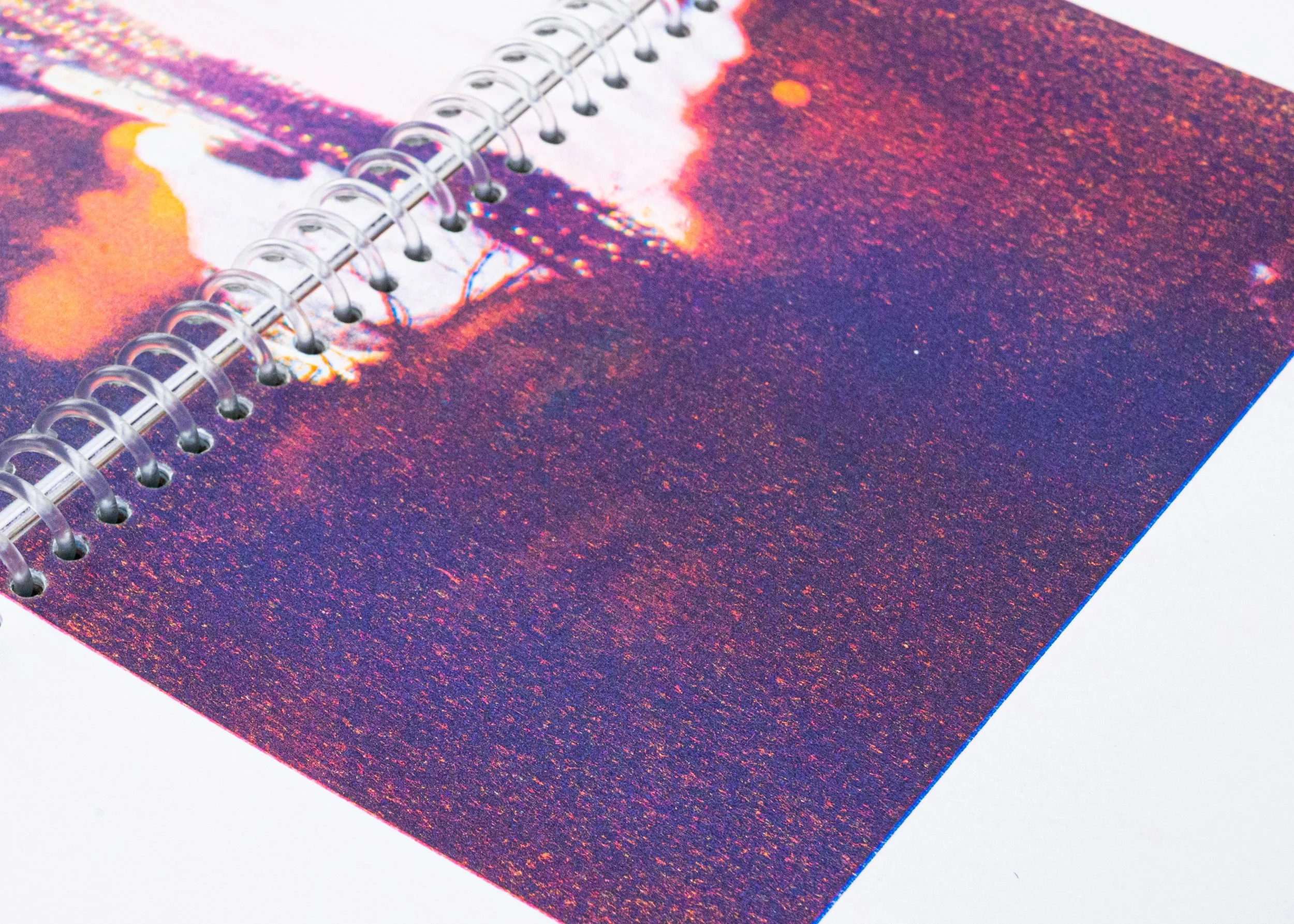
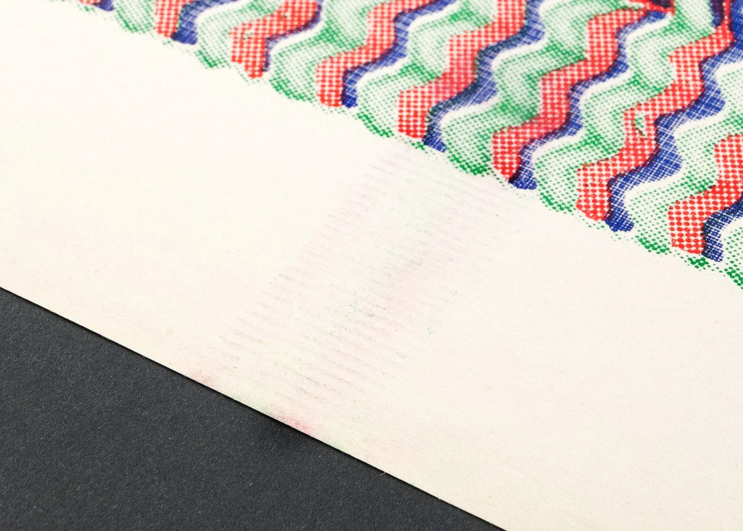
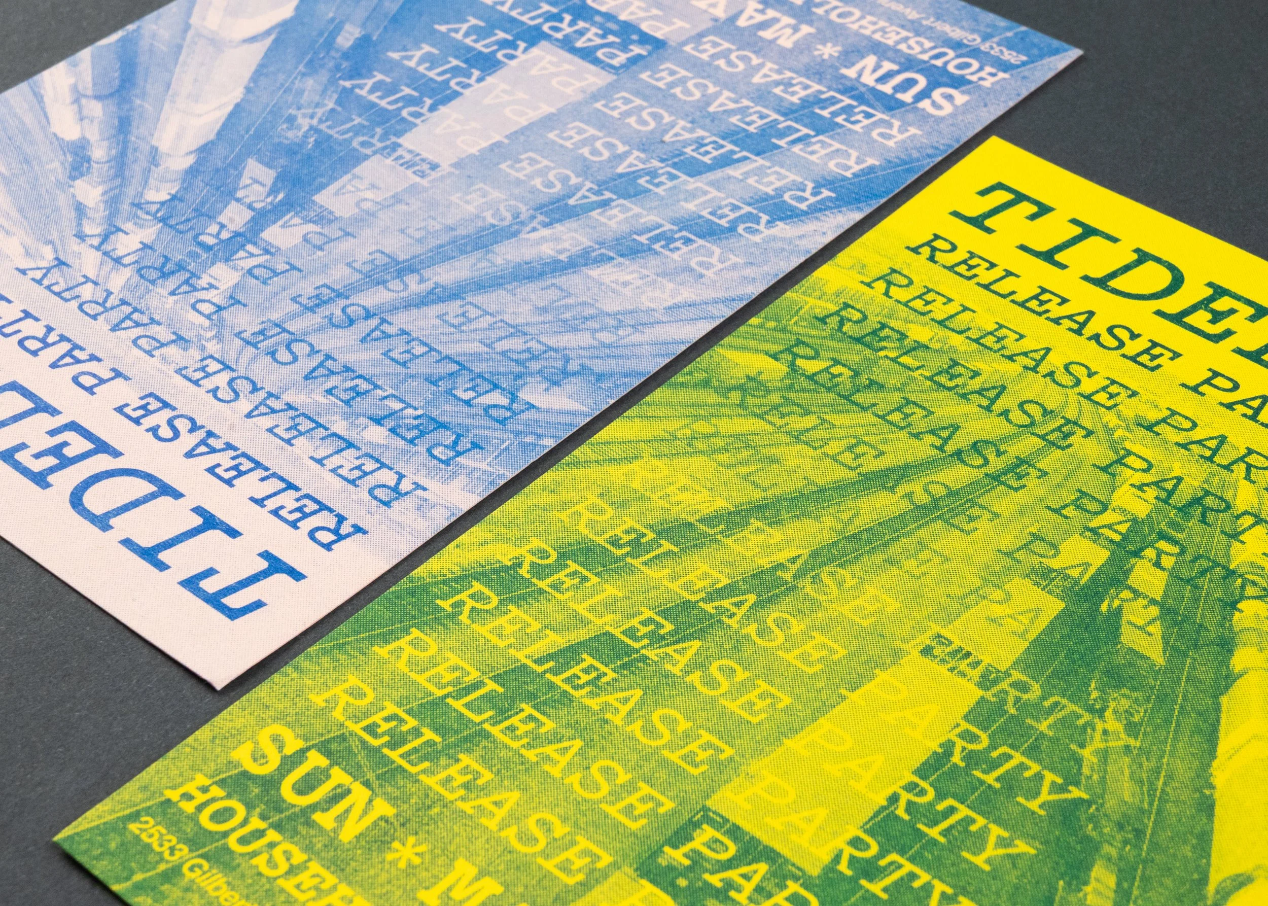
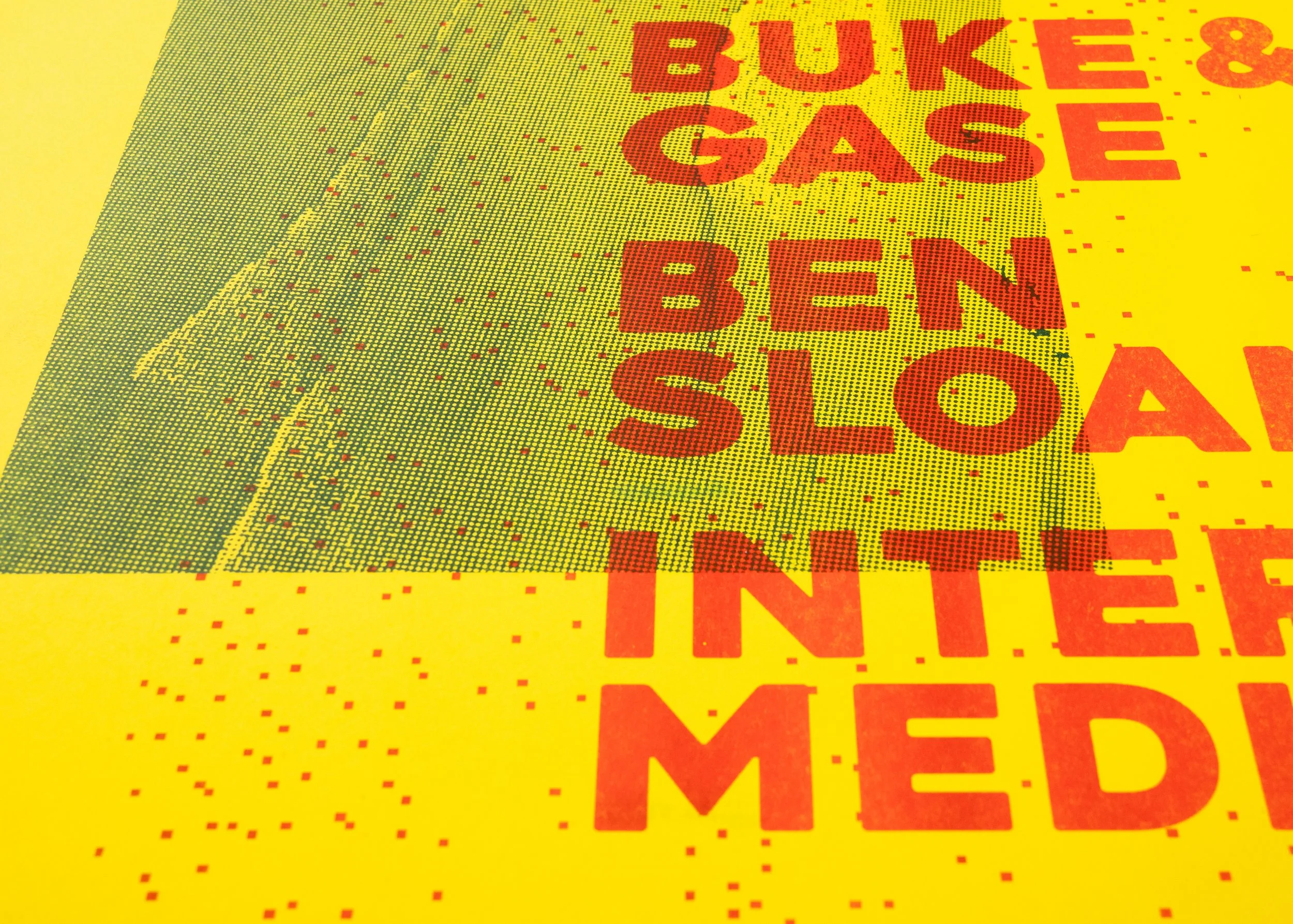
Because riso printing is a hands-on method of printing that involves oil-based inks, variation between prints should be expected. These characteristics are inherent to the process and not considered defects.
Roller Marks: Faint lines or tracks can appear as paper moves through the machine’s feed rollers. This usually happens when printing with 3 or more colors, and with heavy ink coverage.
Misregistration: Slight shifts in alignment between color layers. Because each color is printed separately, tiny movements in the paper can cause layers to appear slightly off, creating unexpected gaps or overlaps between colors.
Smudges: Riso ink is an oil-based formula, meaning it also takes more time to dry in comparison to digital ink-jet or laser prints. Smudging happens the most in areas with heavy ink coverage, and around areas that are touched the most (i.e. book covers, event programs).
Uneven Ink Coverage: Uneven ink texture, due to large areas of printing, or large flats of color. This happens because ink is pushed through a stencil rather than fused digitally.
Misregistration
Ink Texture
Roller Marks
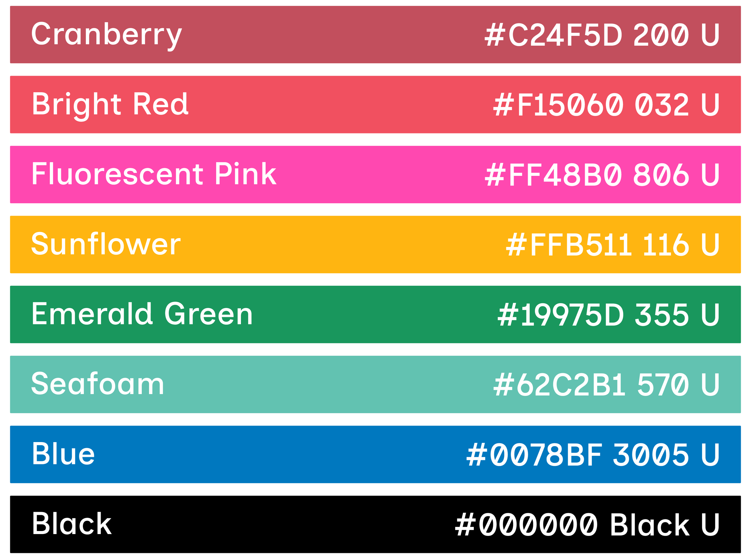
Ink Colors
Riso inks are soy-based, not heat-set. Because of this, prints can feel dry to the touch within a few hours, but full curing may take up to 48 hours, depending on ink coverage, paper stock, humidity, and layering. Since riso inks are transparent, they print best on light colored paper.
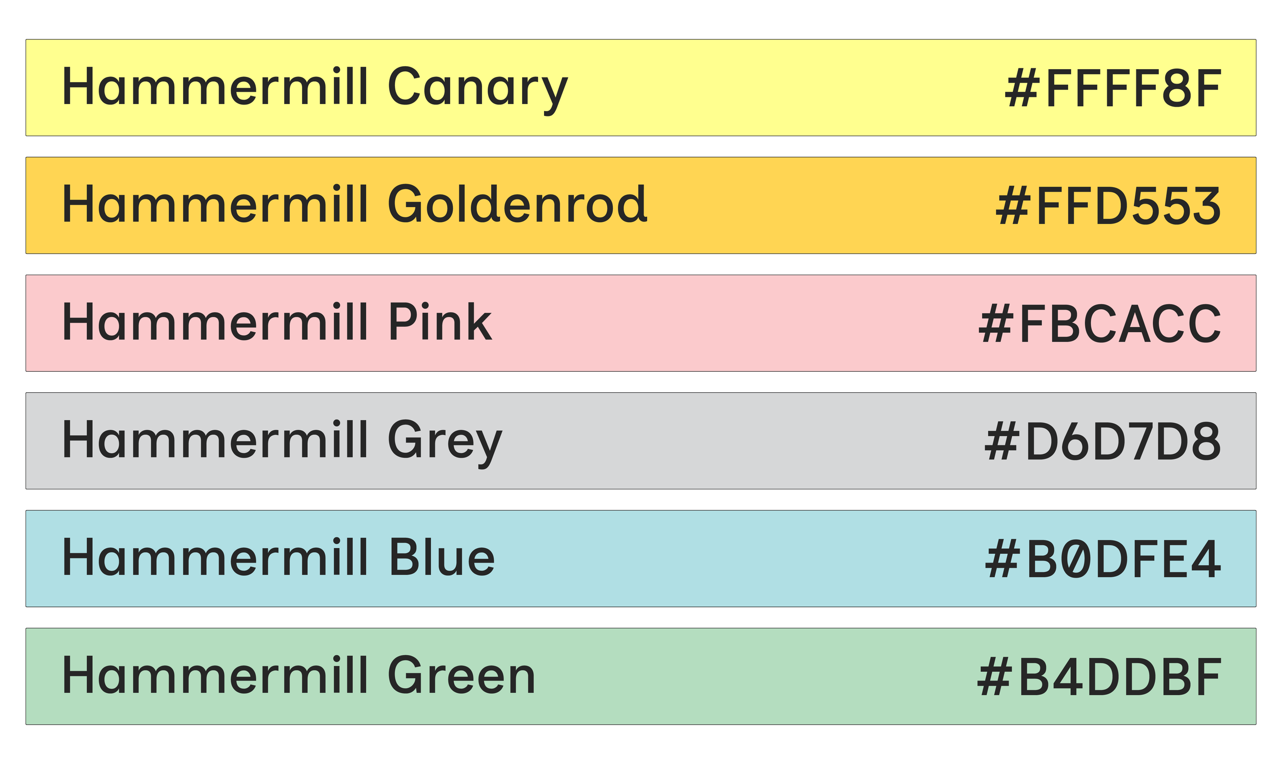
We have 8 colors in our studio, each represented with a hex code and Pantone number below. For more info (CMYK, RGB codes), check out Stencil.Wiki.
Click the button below to download the Cereal Box color library! Drag and drop the .cclibs file into your Creative Cloud app, under Files > Libraries. In your Adobe program, open the Libraries Window, and the Cereal Box colors should be there, ready to use.
1-Color Print (Blue)
2-Color Print (Bright Red & Blue)
3-Color Print (Sunflower, Fluo Pink, Blue)
Project Types
Flat Prints / Cards
Stand-alone prints, either flat or folded.
25-copy / $50-order minimum.
PAPER WEIGHT
20lb Bond - 80lb Cover
PRINT SIZE
11” x 17” is the maximum sheet size we can print on, but 10” x 16” is the max size for a print with full-bleed trim.
FINISHING OPTIONS
Collating (for sets of prints)
Trimming
Corner-Rounding
Folding
Zines
Multi-page folded prints, bound into a single pamphlet. 25-copy minimum.
PAGE SIZE
Up to 8”x10” with full bleed trim
Up to 8.5”x11” no trim
The most economic option is 5”x8” or smaller, due to the way we gang up pages onto a print sheet.
PAGE COUNT
Page count must be a multiple of 4, because each folded sheet results in 4 pages. For zines, we recommend a max page count of 52. Page count includes front cover, front inside, back inside, and back cover.
BINDING OPTIONS
-Stapled ($)
-Machine Sewn ($$)
-Hand-Sewn ($$$)
Books
Longer-form printed projects, bound with a spine, or a hole-punching machine (like twin-loop or spiral).
25-copy project minimum.
PAGE SIZE
Up to 10”x16” with full bleed trim
Up to 11”x17” no trim
The most economic options are 5”x8” or smaller, then 8”x10” or smaller, due to the way we gang up pages on a print sheet.
PAGE COUNT
Twin-Loop Wire: 100 max
Spiral Bind: 200 max
Hand-bound: case by case
Page count includes front cover, front inside, back inside, and back cover.
BINDING OPTIONS
-Twin-Loop Wire ($)
-Plastic or Wire Spiral ($)
-Custom Hand-Sewn ($$$)
Design Considerations
-
Consider how many colors, and which colors, you want to print with—we typically recommend no more than 4 colors.
Opacity in your files equates to color value differences, once printed in that color. Adjusting opacity down creates lighter tones within that color range. We recommend most text be set to 100% opacity, unless you’re using gradients. If you’re printing a large flat of color, consider adjusting opacity down to ~85% to print cleaner, and avoid an overly saturated print that might smudge easily. We don’t recommend setting anything to lighter than 20% opacity.
If working digitally, we recommend setting up your file with the swatches you are going to use (see Cereal Box Color Library) and then previewing color overlaps either through Separations Preview/ Overprint Preview or Multiply Mode, depending on how you decide to work. If using Photoshop, you can use Spot Channels, or you can use Spectrolite to color separate photos for you. See File Setup & Helpful Links below for more suggestions on color separation. -
If you want your images or designs to run off the edge of any pages, you need to include at least .125” of bleed in your file. This means your images should not end at the edge of your page, but should end at your bleed lines. Depending on the program you’re using, the bleed lines will look like a thinner line outside of your page edges. We recommend you set the bleed settings before designing, as you set up your file.
-
It’s important to know how your project will be bound as your are designing so that you know what your page count needs to be, and any limitations regarding the margins or spine.
If you are using a spiral or twin-loop binding, please keep the inner 1/4” margin (spine edge) of each page clear of important elements. These page edges will be punched through with holes for binding.
If you are using a zine binding (stapled or sewn pamphlet), your page count must be a multiple of 4 (including front cover, inside cover, inside back cover, and back cover).
Click here to see our in-house binding options.
-
Because booklets are folded sheets of paper nested inside each other, the inner pages naturally extend slightly beyond the outer ones. This is called page creep. After binding, all pages are trimmed together, which means small shifts in margins can occur.
When designing your booklet, we recommend allowing generous inner and outer margins to ensure important content isn’t trimmed too close to the edge. There is a CREEP setting in InDesign to accommodate for this; let us know if you plan to use it, and we can help you determine how to calculate your adjustment.
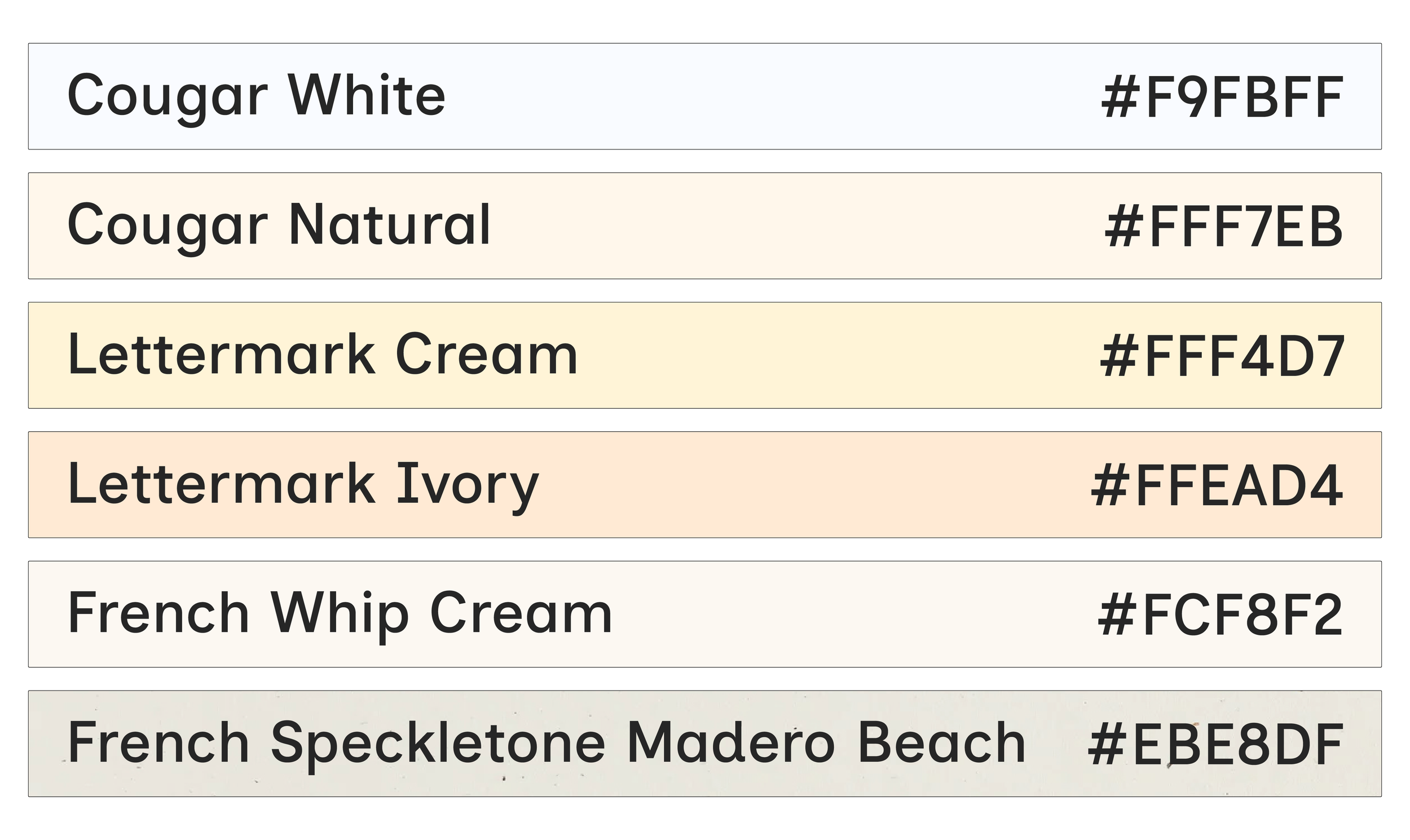
Paper
When choosing paper, you have two general categories: Text Weight & Cover Weight (70T is not the same as 70C!). We can work with any uncoated paper (matte finish, no glossy coatings), up to 11” x 17” in size, and between 50lb Text - 80lb Cover in weight.
50 lb Text (or 50T) ≈ 75–80 gsm
80 lb Cover (or 80C) ≈ 215–220 gsm
BRANDS WE USE OFTEN
Cougar White / Cougar Natural ($)
Lettermark Colors ($)
Neenah Environments & Astrobrights ($$)
French Paper ($$$)
It is helpful to consider how the paper choice will look in combination with the colors and transparencies in your design. Try including a base layer in your files for paper color, but make sure to turn it off before exporting final files!
If something is getting folded, consider the fact that cheaper paper often cracks when folded, even if it’s scored first. A physical test is the best way to tell, but we often recommend slightly more expensive brands if you want to use 80C for covers. If you have a smaller budget, consider a lighter weight option like Lettermark Vellum Bristol 67lb.
File Setup Guidelines
-
We recommend setting up Spot Colors (see our Ink Colors), then using Separations and Overprint previews for the best experience. For photos and other raster-based designs, you can use Multichannel Mode in Photoshop; those channels can then easily integrate as Spot Colors in InDesign or Illustrator. For vector-based content like illustrations or text, you can also use Swatches and Multiply Mode to get an idea of how things will overlap. However, Spot Colors are the best since you don’t need to do any grayscale conversion at the end.
There are so many ways to design and separate colors, but if you’re looking for guidance, check out some of the tutorials linked below.
If you’re not interested in messing with layers or channels, SPECTROLITE is awesome (Mac only free app). It will create color separations from any full-color image or design, based on which ink colors you have chosen, and will give you usable black and white PDFs to print from.
-
For single prints, each color layer must be saved as a separate black-and-white file (grayscale PDFs).
Files should be a minimum of 300 DPI
For full bleed, include .125” of bleed, plus crop marks (no bleed marks)
Please also provide a full-color mockup/ reference file (PDF) so we can see what your design is supposed to look like
-
For zines and books, please review notes on binding and creep to make sure you’ve thought through page count, margins, and whether you want to adjust for creep. If the file needs more than 30 minutes of work, we charge $65/hour for file setup time.
Send a packaged Adobe file (InDesign, Photoshop, or Illustrator), or a link to your Canva file
If separating colors by Spot Color/Channel, make sure your spot colors are assigned and named consistently.
If separating colors by Layer, all content needs to be converted to grayscale, and layers should be grouped/ labeled clearly.
-
For single prints, each color layer must be saved as a separate black-and-white file (greyscale). For books and zines, your design file should come with a full-color reference file (PDF). Please name each file accordingly so we know which file is for which ink color.
if sending black & white files: MyProject_BrightRed.pdf, MyProject_FluoPink.pdf
for your full-color reference file: MyProject_Mockup or MyProject_Proof
Helpful Links
Spot Colors for Photos / Spot Channels (Photoshop & Illustrator)
~Olivia & PindotUsing Multichannel Mode in Photoshop
~CCS Imaging CenterSpot Colors for / Exporting Files for Riso
~Olivia & PindotFree Color Profiles for Photoshop [color/shift] - we don’t have most of these specific colors but there are a lot of close matches, like Brick —> Cranberry or Mint —> Seafoam, etc; Just wanted to share this project.